По-русски

Layers and Levels of Flight

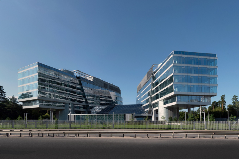
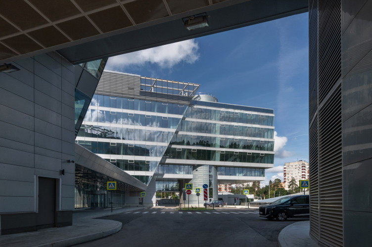
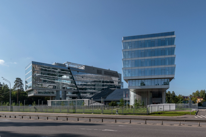
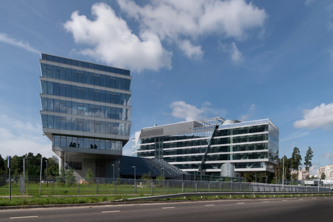
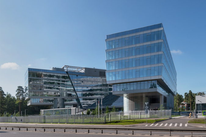
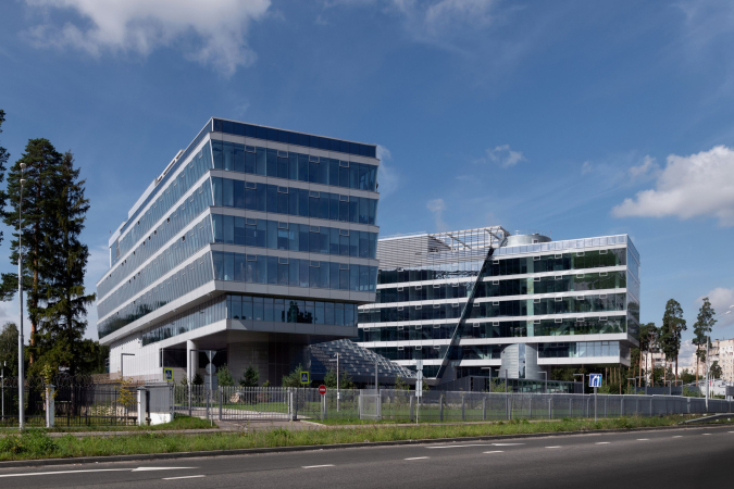
This project goes way back – Reserve Union won this architectural competition at the end of 2011, and the building was completed in 2018, so it’s practically “archival”. However, despite being relatively unknown, the building can hardly be considered “dated” and remains a prime example of architectural expression, particularly in the headquarters genre. And it’s especially fitting for an aviation company office. In some ways, it resembles the Aeroflot headquarters at Sheremetyevo but with its own unique identity, following the signature style of Vladimir Plotkin. In this article, we take an in-depth look at the United Aircraft Corporation (UAC) headquarters in the Moscow agglomeration town of Zhukovsky, supplemented by recent photographs from Alexey Naroditsky – a shoot that became only recently possible due to the fact that improvements were finally made in the surrounding area.

31 October 2024
Object
mainImg
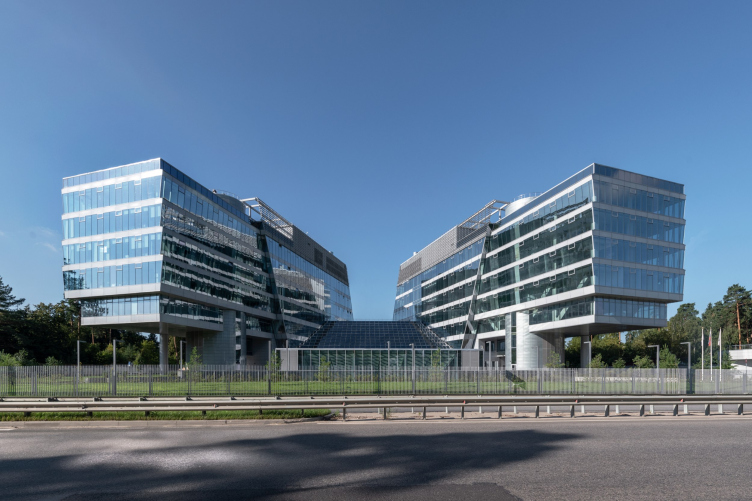
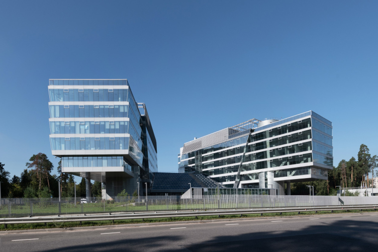
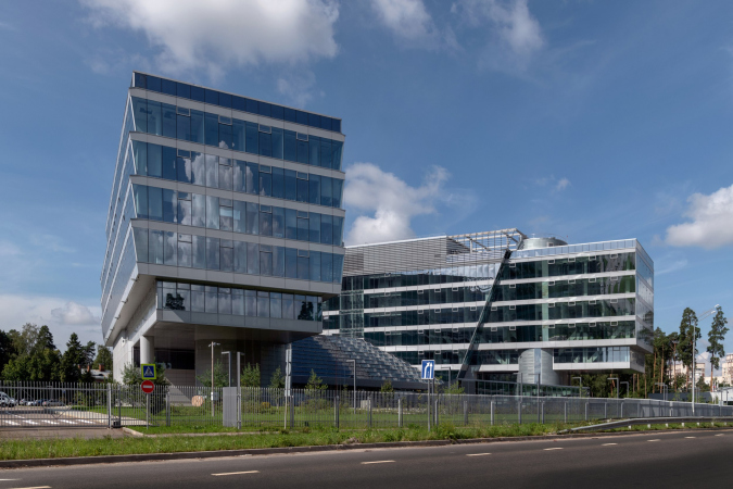
The United Aircraft Corporation (UAC) headquarters is a building of transparency and reflection, bright, soaring, and weightless. Elegantly orchestrated with a few straightforward elements that create complex visual layers, it embodies pretty much everything that we love about contemporary architecture. However, the building still remains somewhat obscure.

The UAC headquarters building in Zhukovsky
Copyright: Photo © Aleksey Naroditsky / provided by Reserve Union


It’s hard to pinpoint the exact reason for that – perhaps because of its location in the Moscow region or the lengthy construction process spanning six years, from 2011 to 2017. During that time, UAC’s management reconsidered using Zhukovsky for the headquarters, partly citing employees’ reluctance to commute from Moscow. The main office ultimately moved to Moscow’s Bolshaya Pionerskaya Street, in a space four times smaller. The Zhukovsky building, designed for 1,500 employees, now houses companies like Red Wings. Although completed in 2018, the site was only recently cleared, allowing for these new photos that we are about to show you.

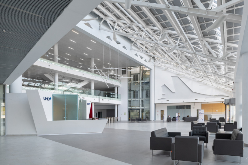
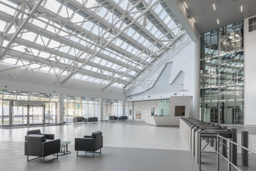
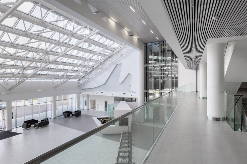
Nonetheless, the building was designed and executed as a true headquarters, complete with all the technical features, a conference hall, a 25-meter pool, and a layout blending open spaces and executive offices – including an open terrace outside the president’s office with views of the airfield. The atrium is notably spacious and bright, with an unusual design that opens up from the entrance, almost blossoming as it reveals a three-story section framed by slender columns and intersecting stair flights.

  • zooming
    The entrance atrium. The UAC headquarters building in Zhukovsky
    Copyright: Photo © Aleksey Naroditsky / provided by Reserve Union
  • zooming
    The balcony of the presidential office, overlooking the airfield. The UAC headquarters building in Zhukovsky
    Copyright: Photo © Aleksey Naroditsky / provided by Reserve Union


In 2011, Reserve Union won the closed-door competition for the UAC headquarters.

The building concept came together very quickly since we were invited to the competition at the very last moment. We sketched the design almost overnight, submitted it, and won – apparently due to the resemblance of the building’s layout to a stealth-type aircraft.

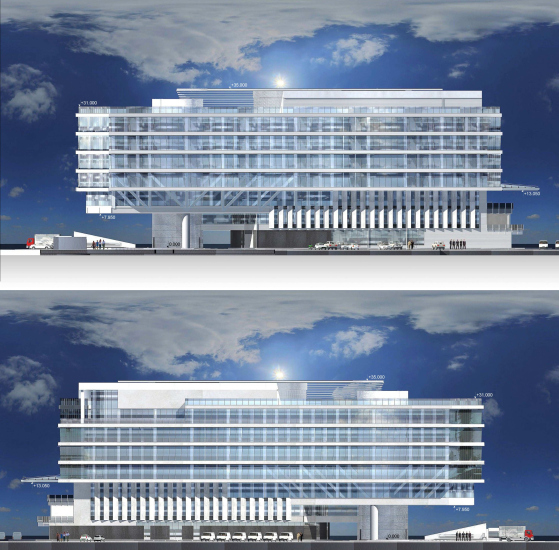
Later, the client insisted that the original idea be fully realized, including the triangular canopy that resembles the nose of a plane and the overhanging sections. To ensure their structural integrity, we added a framework construction within the cantilevered part.


The building’s aerodynamic shape is also emblematic of its headquarters status – perhaps even essential. Here, it’s not just about the layout; the entire structure resembles something airborne, which is perfect for a conglomerate of aerospace companies.

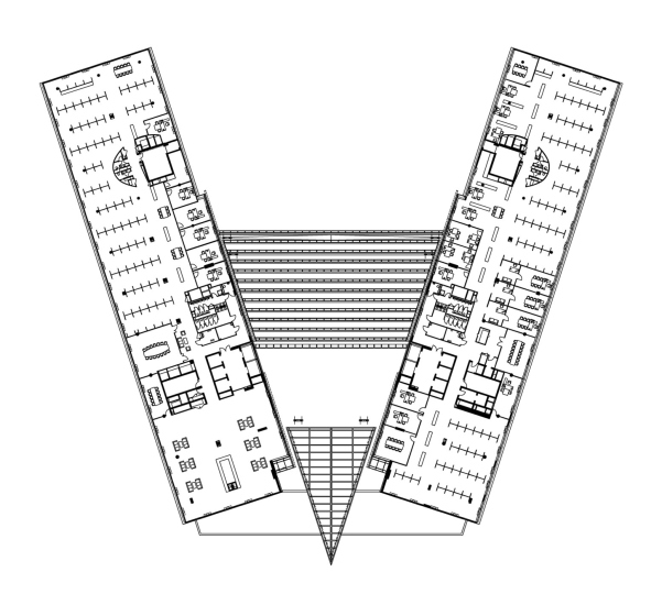
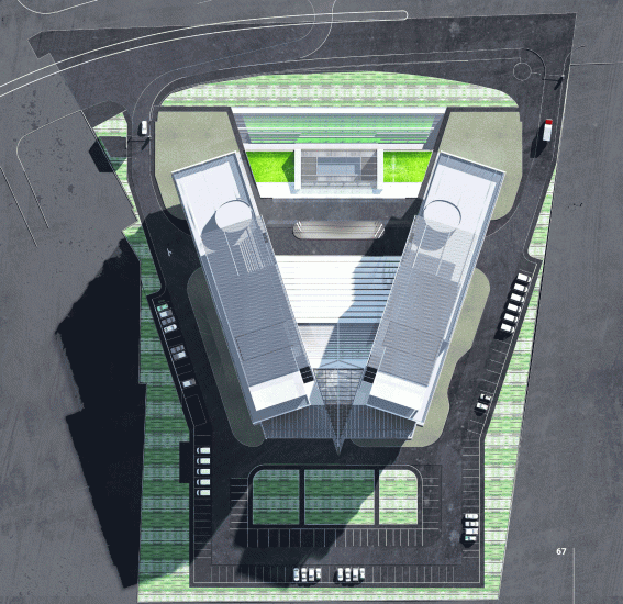
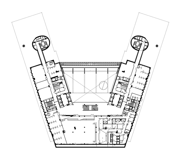
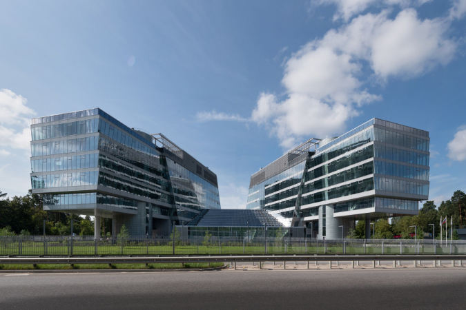
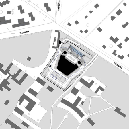
Yet, it’s not a plane-shaped building by any means. The level of abstraction is skillfully maintained, mostly through precise geometric lines. Two nearly identical elongated blocks, each 85 meters long and around 20 meters wide, fan out symmetrically along an axis perpendicular to Tupolev Street, the main thoroughfare. The angle of divergence is 36° – a tenth of a full circle. It’s intriguing to wonder if this angle holds any specific significance in aerospace engineering, as radar screen rays come to mind. While no concrete correlation was found, 36° is known to be the maximum dispersion angle for directional lights, such as flashlight beams.

The two rectangular blocks don’t converge directly; the rays formed by their inner facades meet beyond the structure, outlining the shape of a triangular canopy above a large balcony on the building’s southern end.

  • zooming
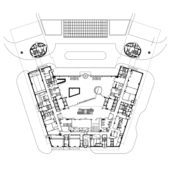
    Plan of the 6th floor. The UAC headquarters building in Zhukovsky
    Copyright: © Reserve Union
  • zooming
    The UAC headquarters building in Zhukovsky
    Copyright: Photo © Aleksey Naroditsky / provided by Reserve Union


It’s a simple and elegant composition. Looking at the plan, you realize that these two lines, which so effortlessly organize the space, define the voids and the mass, the open areas and the filled spaces – surpassing even volume, form, and narrative in importance. It’s striking to see how everything rests on just a couple of lines, lending a surprising lightness to the foundation.

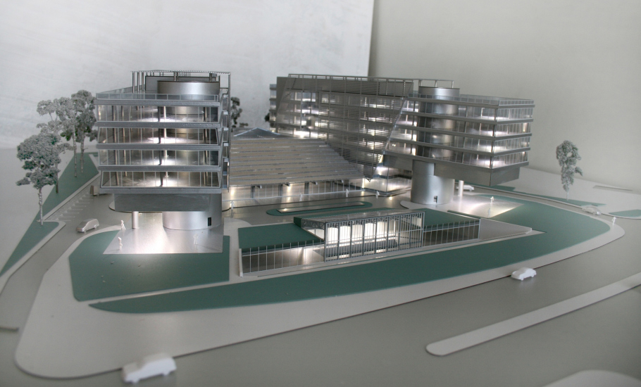
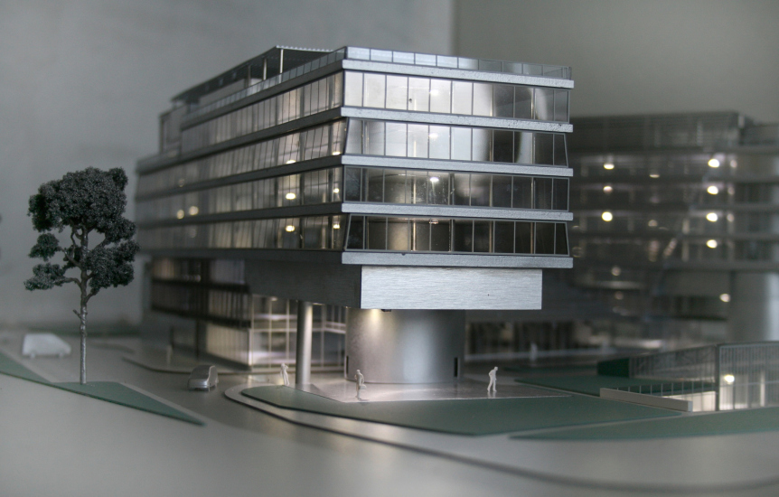
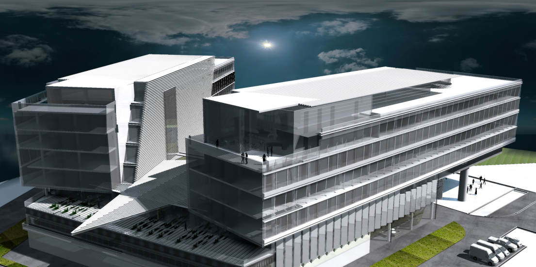
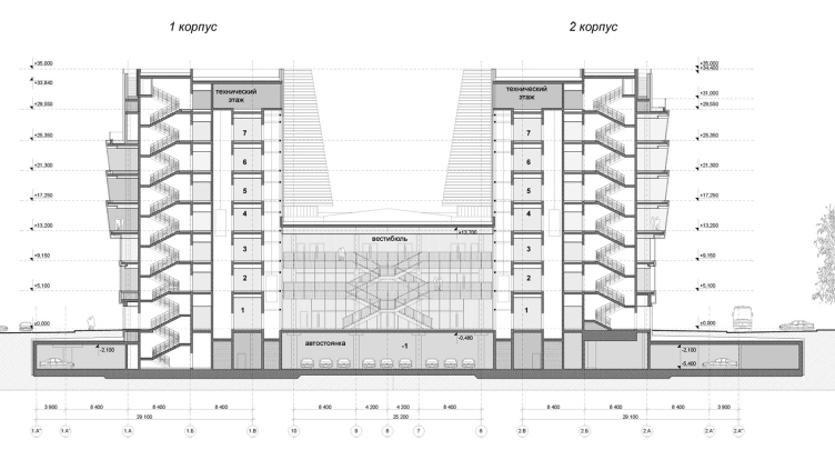
And yet, form is undeniably present: both fluid and impactful, communicating something meaningful to the observer. In fact, there are essentially two forms here. The first is the core and structure – the two blocks that make up the “body” of the building. About half of their length, around 40 meters, floats over the courtyard, supported by massive oval stair towers. These towers pierce the wings from the ground up, protruding visibly on the roof and on all sides of the courtyard, integrating into the structure. These substantial “communication tubes” were part of the project from the outset, as evidenced in the early 2011 model.

  • zooming
    The UAC headquarters building in Zhukovsky
    Copyright: © Reserve Union (2011)
  • zooming
    The UAC headquarters building in Zhukovsky
    Copyright: © Reserve Union (2011)


The towers function as through-pillars, solid anchors. Unlike the conceptual axial geometry of the plan, their rounded, fluid forms add a sense of stability, resilience, and grounding. Acting as bracing elements, they enable cantilevers extending 15 meters forward and 13-meter wide passageways beneath. On the exterior contour, each tower is reinforced by a single circular column – its diameter slightly larger than that of the regular structural columns. On the blueprint, the towers resemble eyes, with the column dots reminiscent of trendy tattoos.

  • zooming
    Plan of the 1st floor. The UAC headquarters building in Zhukovsky
    Copyright: © Reserve Union
  • zooming
    Plan of the 2nd floor. The UAC headquarters building in Zhukovsky
    Copyright: © Reserve Union


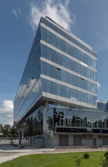
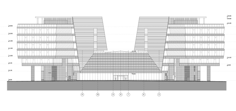
So! The space beneath half of each block is open to both view and movement: the volumes are elevated on “legs” – a classic and beloved technique of 20th-century architecture pioneered by figures like Le Corbusier and Ginzburg. The first level remains free, while the second connects the stair towers to the blocks via a suspended glass walkway, providing convenient alternative entry points. This passage “clings” to the third floor, which, like the levels below, is narrower and shorter than the floors above. Here, the mass of the lower tiers builds gradually upward.

The UAC headquarters building in Zhukovsky
Copyright: Photo © Aleksey Naroditsky / provided by Reserve Union


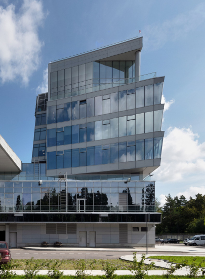
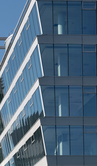
This theme develops across the longitudinal façades of the middle section, from the fourth to the seventh floors. These floors expand diagonally, widening from bottom to top and forming, when viewed in cross-section, a silhouette reminiscent of an upside-down, stylized Christmas tree. We can observe this “cutout” effect at the ends of the blocks.

  • zooming
    The UAC headquarters building in Zhukovsky
    Copyright: Photo © Aleksey Naroditsky / provided by Reserve Union
  • zooming
    The UAC headquarters building in Zhukovsky
    Copyright: Photo © Aleksey Naroditsky / provided by Reserve Union


This solution is uncommon and still rarely seen. A similar form can be found in the design of the clinic building in Kommunarka, also by Reserve Union

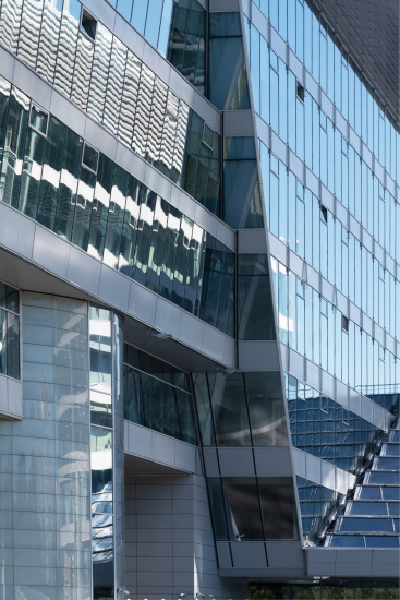
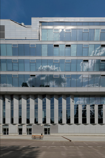
The slanted surfaces fracture the reflections, adding stripes, brightening, and energizing the resulting deep shadows.

  • zooming
    The UAC headquarters building in Zhukovsky
    Copyright: Photo © Aleksey Naroditsky / provided by Reserve Union
  • zooming
    The UAC headquarters building in Zhukovsky
    Copyright: Photo © Aleksey Naroditsky / provided by Reserve Union


These planes also transform what might have been an inert façade of ribbon windows into a kind of “plastique attraction”. The inclined surfaces create a sense of intrigue, enhanced by the rhythm of vent windows articulated by light-colored frames. Originally, the opening window sashes were meant to occupy most of the vertical part of the window, allowing the glass to shift from a slant to vertical when opened. However, the architects ultimately opted for smaller vent windows at the top. On the façades, they too resemble a multitude of eyes, quietly observing.

On closer inspection, the 9° tilt angle of the bands from the 4th to the 7th floors matches – or nearly matches – the tilt of the inner “shell” walls facing the courtyard. This angle, 9°, represents precisely one-fourth of the primary 36° angle that defines the plan’s geometry.

Facade,, view from the north. The UAC headquarters building in Zhukovsky
Copyright: © Reserve Union


These “inner shells” deserve special mention – they comprise the second key aspect of the building’s design.

While the primary structure forms the core, this secondary layer acts more like an outer “shell” or “cloak” draped over the building’s volumes. One might say that the first form is functional, while the second supplies the narrative. This “second form” enhances the theme of flight, evoking wings, uplift, and maintaining associations with an airplane or a bird. This layer is not merely draped but also integrated, with components like diagonal projections of glass walls shielded by louvers, pergola grills on the roof, an overhang “beak”, and the atrium’s roof – its “tail.”

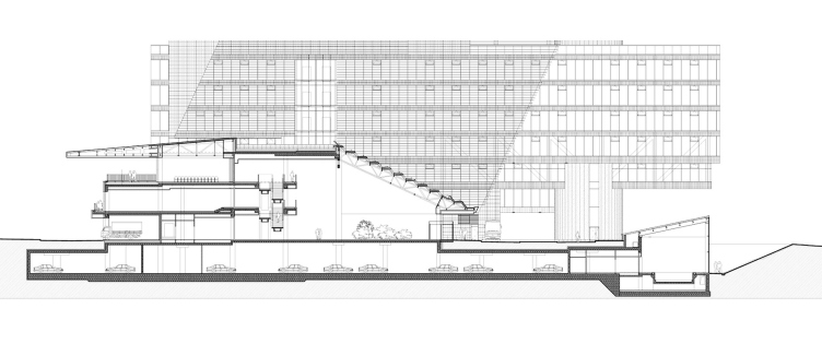
This continuous “nose-to-tail” profile is clear from above and in sectional views, where the canopy structure extends the atrium roofline, while the “wings” sweep upward along the façade.

Longitudinal section. The UAC headquarters building in Zhukovsky
Copyright: © Reserve Union


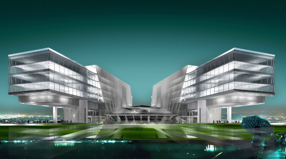
The whole figure is distinguished, first, by a striped texture – louvers, slats, and folded roofing – and second, by a series of planes resembling origami. Together, these elements recall either a spacecraft with upturned wings (reminiscent of designs familiar to everyone from “Star Wars”) or a paper crane seemingly alighting on the headquarters of an aerospace company. This is more than appropriate in this case: inside the building, airplanes are designed, while outside, a symbolic aircraft appears to take shape from structural forms – a visual representation of engineering ideas. This “flight” theme was embedded in the original design concept, with the building’s inner contours embracing the beams of the blocks, which then project out from the shell.

  • zooming
    The UAC headquarters building in Zhukovsky. Perspective view
    Copyright: © Reserve Union (2011)
  • zooming
    The UAC headquarters building in Zhukovsky. A perspective view
    Copyright: © Reserve Union (2011)


By 2022, most of the side façade and pergola louvers were in place, enhancing the “avian” silhouette, emphasizing the layering of forms, and creating reflections from the roof that conjure additional ghostly wings in perspective.

Currently, the louvers on the inner side façades have been removed, but we can hope they’ll be reinstalled, restoring the unified “wing” silhouette.

Even so, the sharp diagonal cutting across the façade already conveys a “flying” profile. When viewed from a courtyard angle through the open space beneath one wing towards the other, the building reveals a striking origami effect, as though assembled from intersecting planes – like a structure made from folded paper, or glass and metal. Geometry plays a critical role in this impression; the angle between the atrium roof’s slope and the diagonal projection on the façade is exactly 90°. This precision allows the interrelation of lines and angles to be fully felt, reinforcing the building’s design logic where each angle connects harmoniously to the next and one thing leads to another.

The tilt of the atrium roof, reminiscent of a spacecraft gangway, suggests a sense of purposeful mechanics.

And where there’s mechanics, there’s also dynamics. This internal “drive” is tangible, regardless of how the louvered textures layer upon it.

In the southern section, where there are no cantilevered sections, the facades of the three lower “podium” floors are designed like an accordion of triangular bays. Half of each triangle is solid, while the other half is glass, a signature approach of Vladimir Plotkin’s, seen previously in projects like Skolkovo Park and the distinctive serrated base of the “Faces” residential complex.

Here, the glass facets face south, capturing both sunlight and views of the forest.

View from the southern wing towards the northern one. The UAC headquarters building in Zhukovsky
Copyright: Photo © Aleksey Naroditsky / provided by Reserve Union


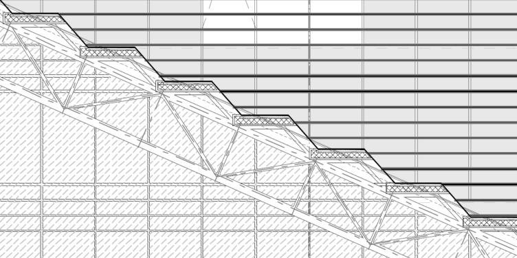
The stepped atrium roof complements this “accordion” or “bellows” design, with horizontal opaque surfaces interlaced with inclined glass sections set at 49°, each one heated to maintain clarity.

  • zooming
    The UAC headquarters building in Zhukovsky
    Copyright: Photo © Aleksey Naroditsky / provided by Reserve Union
  • zooming
    The UAC headquarters building in Zhukovsky
    Copyright: © Reserve Union


If all the surfaces were glass, horizontal panes would need frequent cleaning. However, with so many inclined glass sections, water naturally flows down them year-round, maintaining a clear view.

The principle of the roof is thus similar to that of sawtooth skylights, but smaller in scale. Despite the fact that the atrium opens to the northeast, the glass strips capture enough light, and the white structures inside effectively diffuse it. It’s debatable whether embossed airplane shapes on the end walls add value, but the white boomerang-shaped fixtures attached to the ceiling definitely fit perfectly within the space.

The roof of the atrium, a section view. Fragment. The UAC headquarters building in Zhukovsky
Copyright: © Reserve Union


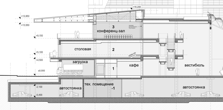
The most intriguing feature of the atrium is its visual openness. Through the glass façade, it connects seamlessly with the street, while the internal balconies, sliced by a single plane, further strengthen the sense of unfolding space. This openness also reveals the full interior of the stylobate section in a singular cross-section view.

The grand staircase is especially noteworthy. On the one hand, it is suspended in the air and is cutting diagonally across the center, on the other – it appears in profile, as though cross-sectioned. Traditionally, a grand staircase in a multi-story lobby would wrap around the space in a Baroque manner. Here, however, the direct slice approach adds a different kind of intrigue, bringing the design drawing to life. This unconventional staging is compelling in its own right, as opposed to the hypothetical “classical” solution.

  • zooming
    The UAC headquarters building in Zhukovsky
    Copyright: Photo © Aleksey Naroditsky / provided by Reserve Union
  • zooming
    The UAC headquarters building in Zhukovsky
    Copyright: Photo © Aleksey Naroditsky / provided by Reserve Union


Here, in the southern trapezoidal area from the first to the third floors, there are cafés, a dining hall, and a conference room with large meeting rooms on either side. These spaces open not only into the atrium via internal balconies and the staircase but also to the outside. The southern façade features a dining hall balcony and a spacious eight-meter-deep terrace adjoining the conference hall, situated under the iconic canopy where the two main plan axes converge.

Cross-section view (3-3). The UAC headquarters building in Zhukovsky
Copyright: © Reserve Union


Other open terraces enhance the building’s adaptability. Aside from the balcony attached to the main office, both the flat atrium roof between the wings and the wings’ own roofs could potentially be used as outdoor spaces.

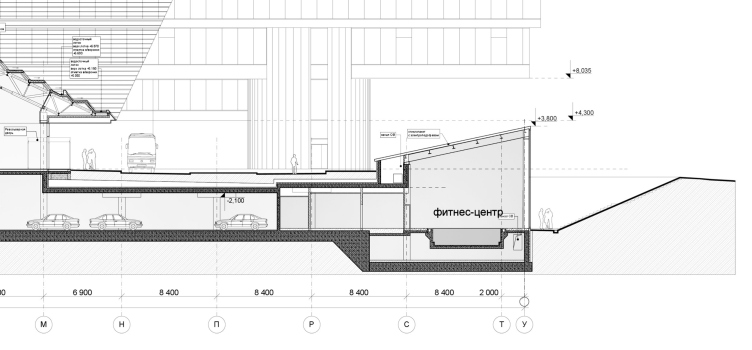
But there is more to it than that: the United Aircraft Corporation headquarters includes a fitness center for 78 people, featuring a 25x6 meter pool positioned near Tupolev Street and partially sunken into the ground. The locker rooms and workout areas are located at the underground parking level, while the pool itself is topped with a glass roof tilted southward to capture more natural light, with electrically heated glass, similar to the atrium. The fitness center’s northern façade, also entirely glass, overlooks a ramp and stair-accompanied slope.

Longitudinal section. Fragment. The UAC headquarters building in Zhukovsky
Copyright: © Reserve Union


This way, the pool area of the United Aircraft Corporation headquarters receives plenty of natural light, maybe even too much. In the courtyard, one can see an intriguing “meeting” of two inclined surfaces: one, the atrium’s tiered, striped roof, and the other, the roof over the pool.

Longitudinal section. Fragment. The building of the fitness center. The UAC headquarters building in Zhukovsky
Copyright: © Reserve Union


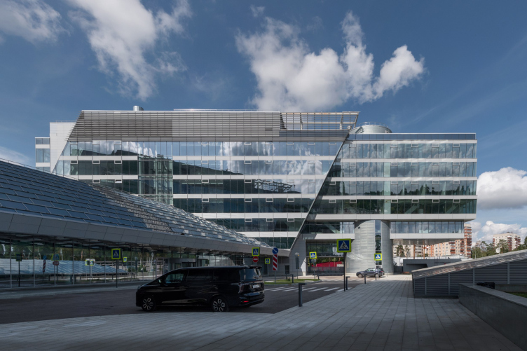
In the photographs, the fitness center’s raised section, tucked between two wings, can be seen from the “façade” side, almost like a “master key” controlling the building’s majestic movement.

The UAC headquarters building in Zhukovsky
Copyright: Photo © Aleksey Naroditsky / provided by Reserve Union


Designed almost entirely by the end of 2011, the United Aircraft Corporation building logically aligns with Vladimir Plotkin’s broader portfolio. Its parallels with the Aeroflot headquarters (2004–2010) reflect their shared aviation theme and headquarters status, yet the two buildings are by no means identical. Both feature “wings,” a composition of two structures with an atrium, courtyard, and reflections, along with stair towers beneath the wings. However, Aeroflot’s “catamaran” composition, rooted in Plotkin’s earlier work on the house at Zagorsky Passage (1998-1999), diverges significantly from the United Aircraft Corporation HQ. That being said, the differences begin, and these distinctions, though within the same paradigm, are sufficient to set them apart. The Huaming Park (2012–2023) shares a similar triangular layout and lamellae grid – like a “veil” that enhances the façade’s integrity. In addition other visual parallels gradually emerge, including those with Vladimir Plotkin’s outpatient hospital building in Kommunarka.

Yet all these elements converge into a new and highly individual character. This building stands out with a greater sense of “foldedness,” a play with planes and angles, and, once you find yourself within the company’s secure grounds, some sort of unexpected openness, a sense of the entire structure “unfolding.” The building even displays a layered or “stratified” quality in its glass-and-metal volumes. For example, where Aeroflot’s office had sharp, slanted noses, here both ends are cut by a flat plane, making them appear as segments of something larger – a kind of infinite ribbon. The concept of flight here is felt differently too, as if suggesting a gentle, perhaps gravity-defying landing. And we all know, after all, don’t we, that for airplanes those moments of takeoff and landing are the most crucial.
  • zooming
    1 / 7
    The UAC headquarters building in Zhukovsky
    Copyright: Photo © Aleksey Naroditsky / provided by Reserve Union
  • zooming
    2 / 7
    The UAC headquarters building in Zhukovsky
    Copyright: Photo © Aleksey Naroditsky / provided by Reserve Union
  • zooming
    3 / 7
    The UAC headquarters building in Zhukovsky
    Copyright: Photo © Aleksey Naroditsky / provided by Reserve Union
  • zooming
    4 / 7
    The UAC headquarters building in Zhukovsky
    Copyright: Photo © Aleksey Naroditsky / provided by Reserve Union
  • zooming
    5 / 7
    The UAC headquarters building in Zhukovsky
    Copyright: Photo © Aleksey Naroditsky / provided by Reserve Union
  • zooming
    6 / 7
    The UAC headquarters building in Zhukovsky
    Copyright: Photo © Aleksey Naroditsky / provided by Reserve Union
  • zooming
    7 / 7
    Location plan. The UAC headquarters building in Zhukovsky
    Copyright: © Reserve Union


31 October 2024

Headlines now
Gold in the Sands
A new office for a transcontinental company specializing in resource extraction and processing has opened in Dubai. Designed by T+T Architects, masters of creating spaces that are contemporary, diverse, flexible, and original, this project exemplifies their expertise. On the executive floor, a massive brass-clad partition dominates, while layered textures of compressed earth create a contextually resonant backdrop.
Layers and Levels of Flight
This project goes way back – Reserve Union won this architectural competition at the end of 2011, and the building was completed in 2018, so it’s practically “archival”. However, despite being relatively unknown, the building can hardly be considered “dated” and remains a prime example of architectural expression, particularly in the headquarters genre. And it’s especially fitting for an aviation company office. In some ways, it resembles the Aeroflot headquarters at Sheremetyevo but with its own unique identity, following the signature style of Vladimir Plotkin. In this article, we take an in-depth look at the United Aircraft Corporation (UAC) headquarters in the Moscow agglomeration town of Zhukovsky, supplemented by recent photographs from Alexey Naroditsky – a shoot that became only recently possible due to the fact that improvements were finally made in the surrounding area.
Light and Shadow
In this article, we delve into the architectural design of the “Chaika” house by DNK ag architects, which was recently completed in 2023 as part of the collection of signature designs at ZILArt. As is well-known, all the buildings in this complex follow a design code, yet each one is distinct. This particular building stands out not only for its whiteness and minimalism but also for the refined use of a limited number of techniques that, together, create what can confidently be called synergy.
Casus Novae
A master plan was developed for a large residential area with a name of “DNS City”, but now that its implementation began, the plan has been arbitrarily reformatted and replaced with something that, while similar on the surface, is actually quite different. This is not the first time such a thing happens, but it’s always frustrating. With permission from the author, we are sharing Maria Elkina’s post.
Treasure Hunting
The GAFA bureau, in collaboration with Tegola and Arkhitail, organized an expedition to the island of Kilpola in Karelia as part of Moskomarkhitektura’s “Open City” festival. There, amidst moss and rocks, the students sought answers to questions like: what is the sacred, where does it dwell, and what sustains it? Assisting the participants in this quest were landscape engineer Evgeny Levin, artist Nicholas Roerich, a moose, and the lack of cellular connection. Here’s how the story unfolded.
Depths of the Earth, Streams of Water
In the Malaya Okhta district, the Akzent building, designed by Stepan Liphart, was constructed. It follows a classic tripartite structure, yet it’s what you might call “hand-drawn”: each façade is unique in its form and details, some of which aren’t immediately noticeable. In this article, we explore the context and, together with the architect, delve into how the form was developed.
Fir Tree Dynamics
The “Airports of Region” holding is planning to build an airport in Karachay-Cherkessia, aiming to make the Arkhyz and Dombay resorts more accessible to travelers. The project that won in an invitation-only competition, submitted by Sergey Nikeshkin’s KPLN, blends natural imagery inspired by the shape of a conifer seed, open-air waiting spaces, majestic large trees, and a green roof elevated on needle-like columns. The result is both nature-inspired and WOW.
​A Brick Shell
In the process of designing a clubhouse situated among pine trees in a prestigious suburban area near Moscow, the architectural firm “A.Len” did the façade design part. The combination of different types of brick and masonry correlates with the volumetric and plastique solutions, further enhanced by the inclusion of wood-painted fragments and metal “glazing”.
Word Forms
ATRIUM architects love ambitious challenges, and for the firm’s thirtieth anniversary, they boldly play a game of words with an exhibition that dives deep into a self-created vocabulary. They immerse their projects – especially art installations – into this glossary, as if plunging into a current of their own. You feel as if you’re flowing through the veins of pure art, immersed in a universe of vertical cities, educational spaces – of which the architects are true masters – and the cultural codes of various locations. But what truly captivates is the bold statement that Vera Butko and Anton Nadtochy make, both through their work and this exhibition: architecture, above all, is art – the art of working with form and space.
Flexibility and Acuteness of Modernity
Luxurious, fluid, large “kokoshniks” and spiral barrel columns, as if made from colorful chewing gum: there seem to be no other mansion like this in Moscow, designed in the “Neo-Russian-Modern” style. And the “Teremok” on Malaya Kaluzhskaya, previously somewhat obscure, has “come alive with new colors” and gained visibility after its restoration for the office of the “architectural ecosystem” as the architects love to call themselves. It’s evident that Julius Borisov and the architects at UNK put their hearts into finding this new office and bringing it up to date. Let’s delve into the paradoxes of this mansion’s history and its plasticity. Spoiler: two versions of modernity meet here, both balancing on the razor’s edge of “what’s current”.
Yuri Vissarionov: “A modular house does not belong to the land”
It belongs to space, or to the air... It turns out that 3D printing is more effective when combined with a modular approach: the house is built in a workshop and then adapted to the site, including on uneven terrain. Yuri Vissarionov shares his latest experience in designing tourist complexes, both in central Russia and in the south. These include houseboats, homes printed from lightweight concrete using a 3D printer, and, of course, frame houses.
​Moscow’s First
“The quality of education largely depends on the quality of the educational environment”. This principle of the last decade has been realized by Sergey Skuratov in the project for the First Moscow Gymnasium on Rostovskaya Embankment in the Khamovniki district. The building seamlessly integrates into the complex urban landscape, responding both to the pedestrian flow of the city and the quiet alleyways. It skillfully takes advantage of the height differences and aligns with modern trends in educational space design. Let’s take a closer look.
Looking at the Water
The site of Villa Sonata stretches from the road to the water’s edge, offering its own shoreline, pier, and a picturesque river panorama. To reveal these sweeping views, Roman Leonidov “cut” the façade diagonally parallel to the river, thus getting two main axes for the house and, consequently, “two heads”. The internal core – two double-height spaces, a living room and a conservatory, with a “bridge” above them – makes the house both “transparent” and filled with light.
The White Wing
Well, it’s not exactly white. It’s more of a beige, white-stone structure that plays with the color of limestone – smoother surfaces are lighter, while rougher ones are darker. This wing unites various elements: it absorbs and interprets the surrounding themes. It responds to everything, yet maintains a cohesive expression – a challenging task! – while also incorporating recognizable features of its own, such as the dynamic cuts at the bottom, top, and middle.
Urban Dunes
The XSA Ramps team designed and built a three-part sports hub for a park in Rostov-on-Don, welcoming people of all ages and fitness levels. The skate plaza, pump track, and playground are all meticulously crafted with details that attract a diverse range of visitors. The technical execution of the shapes and slopes transforms this space into a kind of sculptural composition.
Proportional Growth
The project for the fourth phase of the ÁLIA residential area has been announced. The buildings are situated on an elongated plot – almost a “ray” that shoots out from the center of the area towards the river. Their layout reflects both a response to Moscow’s architectural preferences over the past 15 years, shifting “from blocks to towers”, and an interpretation of the neighboring business park designed by SOM. Additionally, the best apartments here are not located at the very top but closer to the middle, forming a glowing “waistline”.
The “Staircase” Building
In designing the “Details” residential complex in New Moscow, Rais Baishev spiced up the now-popular Moscow theme of a “courtyard” building with an idea drawn from the surrealist drawings by Maurits Escher. He envisioned the stepped silhouettes and descending slopes as a metaphysical mega-staircase, creating a key void within the courtyard that gave the project an internal “spine”. This concept is felt both in the building’s silhouette and on its façades.
Projection of the Quarter
No one doubted that the building that Vladimir Plotkin designed as part of the “Garden Quarters” would be the most modernist of all. And it turned out just that way: while adhering to the common design code, the building successfully combines brick and white stone, rhythmically responding to the neighboring building designed by Ostozhenka, yet tactfully and persistently making a few statements of its own. This includes the projection of the ideal urban development composition “14–9–6”, which can be found right next door, mathematical calculations, including those for various types of terraces (and perhaps the only reminder of the Soviet past of the Kauchuk rubber factory!), and the white “cross-stitch” pattern of the façade grid.
Domus Aurea
In this issue, we examine the “Tessinsky-1” house, designed by Sergey Skuratov and completed in 2023. Located in the middle of the Serebryanicheskaya Embankment district, at the intersection of its main streets, this house assumes a sort of “nodal” role: it not only responds to everything around it and preserves many memories of the former EMA factory within itself, but it weaves all this into a newly directed pattern, reconciling bright “gold” and dark-colored brick, largely with the help of the new, modern-yet-archaic Columba brick, which, come to think about it, is the most precious element here.
The Chimney of Nikola-Lenivets
In this issue, we are examining the “Obelisk House” designed by KATARSIS and built for the Arkhstoyanie 2023 festival. However, it was only finished later on, and this is why we are examining it now. It seems to us that after the “Obelisk House” appeared in Nikola-Lenivets, a dialogue and a few inner connections appeared between the temporary structures built here. These houses no longer look like “accidental neighbors”, more of which below.
​Periscope by the Bay
The jury awarded the second place in the competition for a public and cultural center in Petropavlovsk-Kamchatsky to the companies GORA (“Mountain”) and M4. In the consortium’s proposal, the building resembles a sperm whale with a calf swimming next to it or a periscope, whose lenses capture the most spectacular views from the surrounding landscape.
From Arcs to Dolmens
While working on the competition project for Petropavlovsk-Kamchatsky, ASADOV Architects prioritized the value of the natural and urban environment, aiming to preserve the balance of the location while minimizing the resemblance of the volume that they designed to a “traditional building”. The task was challenging, and the architects created three versions, one of which having been developed after the competition, where their main proposal took third place. However, the point of interest here is not the competition result but the continuity of creative thinking.
Hide and Seek
The ID Moskovskiy house, designed by Stepan Liphart in St. Petersburg, in the courtyards near Moskovskiy Avenue beyond the Obvodny Canal and recently completed, is notable for several reasons. Firstly, it has been realized with considerable accuracy, which is particularly significant as this is the first building where the architect was responsible not only for the facades but also for the layouts, allowing for better integration between the two. On the other hand, this building is interesting as an example of the “germination” of new architecture in the city: it draws on the best examples from the neighborhood and becomes an improved and developed sum of ideas found by the architect in the surrounding context.
The Big Twelve
Yesterday, the winners of the Moscow Mayor’s Architecture Award were announced and honored. Let’s take a look at what was awarded and, in some cases, even critique this esteemed award. After all, there is always room for improvement, right?
Above the Golden Horn
The residential complex “Philosophy” designed by T+T architects in Vladivostok, is one of the new projects in the “Golubinaya Pad” area, changing its development philosophy (pun intended) from single houses to a comprehensive approach. The buildings are organized along public streets, varying in height and format, with one house even executed in gallery typology, featuring a cantilever leaning on an art object.
Nuanced Alternative
How can you rhyme a square and space? Easily! But to do so, you need to rhyme everything you can possibly think of: weave everything together, like in a tensegrity structure, and find your own optics too. The new exhibition at GES-2 does just that, offering its visitor a new perspective on the history of art spanning 150 years, infused with the hope for endless multiplicity of worlds and art histories. Read on to see how this is achieved and how the exhibition design by Evgeny Ace contributes to it.
Blinds for Ice
An ice arena has been constructed in Domodedovo based on a project by Yuri Vissarionov Architects. To prevent the long façade, a technical requirement for winter sports facilities, from appearing monotonous, the architects proposed the use of suspended structures with multidirectional slats. This design protects the ice from direct sunlight while giving the wall texture and detail.
Frozen Magma
A competition for the creation of a public and cultural center was held in Petropavlovsk-Kamchatsky. Three architectural companies made it to the final, and we consider it important to share about the work of each. Let’s start with the winner – the consortium led by Wowhaus.
Campus within a Day
In this article, we talk about what the participants of Genplan Institute of Moscow’s hackathon were doing at the MosComArchitecture booth at the “ArchMoscow” exhibition. We also discuss who won the prize and why, and what can be done with the territory of a small university on the outskirts of Moscow.
Vertical Civilization
Genpro considered the development of the vertical city concept and made it the theme of their pavilion at the “ArchMoscow” exhibition.