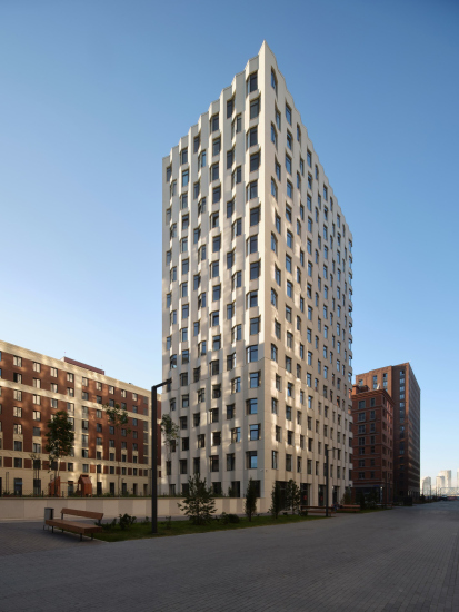
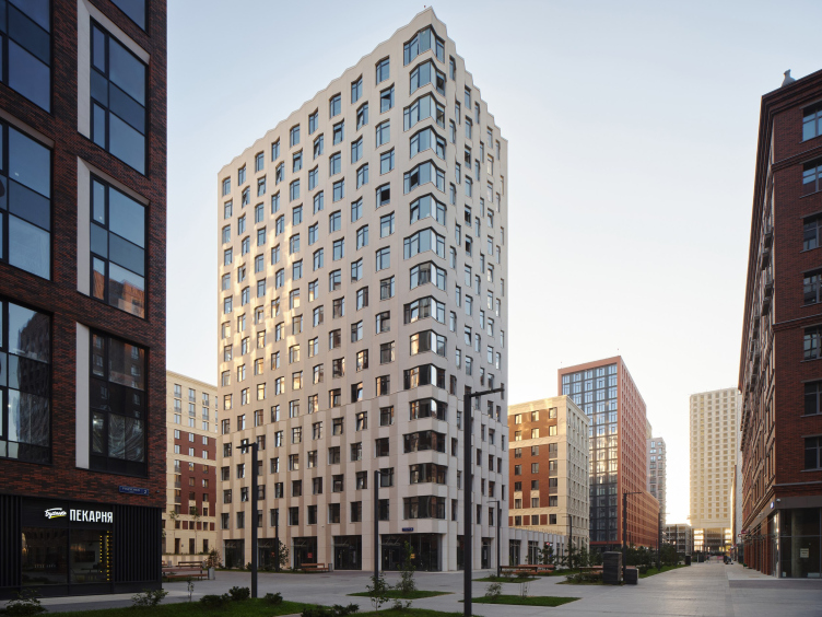
This is how the whitest building in ZILArt came to life.
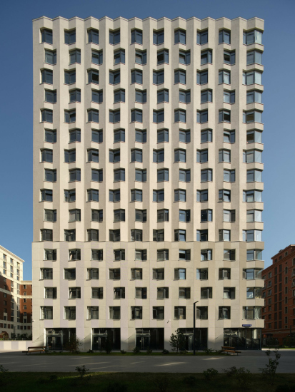
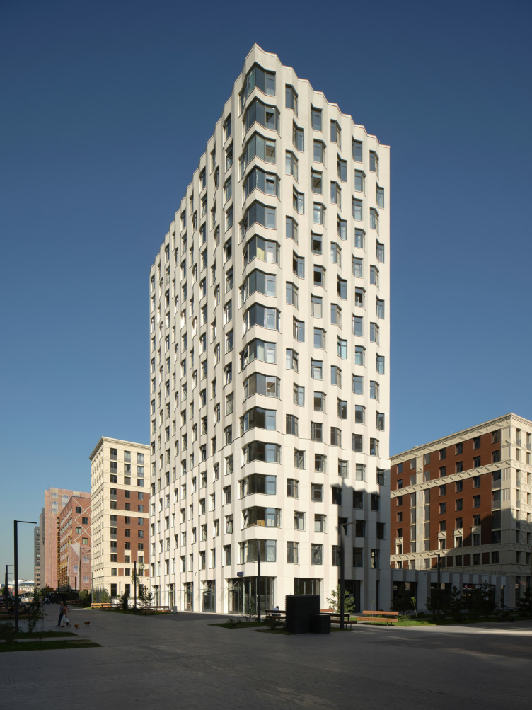
The eye is drawn to it within the overall setting, and the building is easy to spot even without knowing its exact address. This building is a catcher and diffuser of light, a kind of “minimalist emissary” in a richly diverse environment. Comparing it to the proverbial “blank canvas” might not be entirely accurate. However, there is a certain “paper-like” quality to the building – imagine a sheet folded into an accordion and assembled into a vertical volume. It’s the kind of “paper quality” that conveys lightness. Alternatively, one might think of the building as plaster, like an architectural model or an object from an art class – not a typical form like a stereometric shape or Antinous’ head, but something more intricate for abstract, geometric drawing. Once upon a time, we were taught how to draw crumpled drapery, being told it was one of the most challenging tasks: capturing the shadows and highlights of every fold while still conveying the hidden shape beneath the fabric.
The story here is similar, though not identical. The house is designed as a screen for observing light and shadow, reflections, and highlights. It’s most impressive when illuminated at an angle, but it remains intriguing in any light – not so much for how it looks at any particular moment but for how it changes, while retaining simplicity and coherence. In this sense, it is a canvas on which the sun “draws.”
Block 14.1 “Chaika”. ZILArt
Copyright: Photograph © Maxim Loskutov / provided by DNK ag
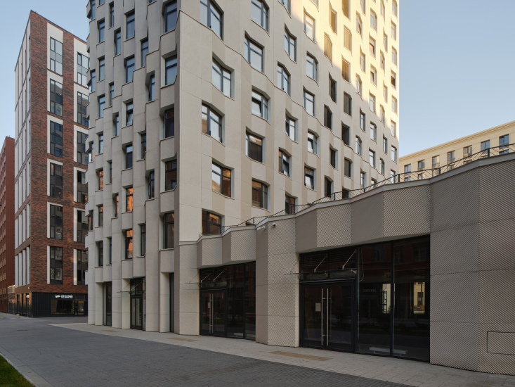
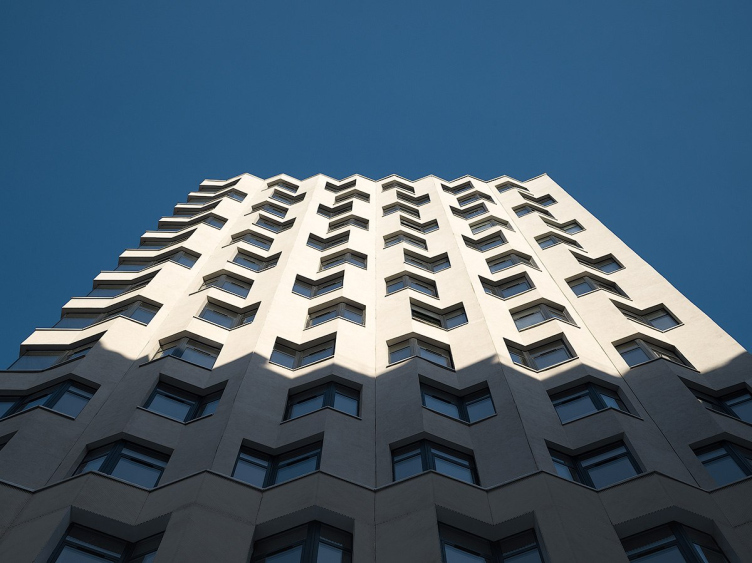
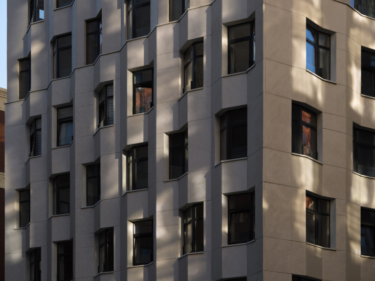
For shadows to detach from the light, they need something to cling to, and here the façades offer two such opportunities.
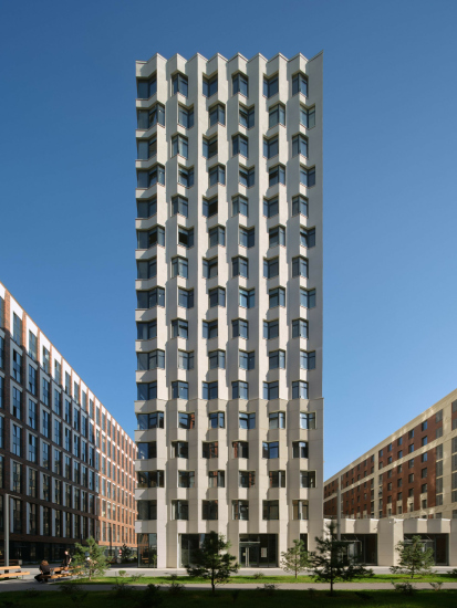
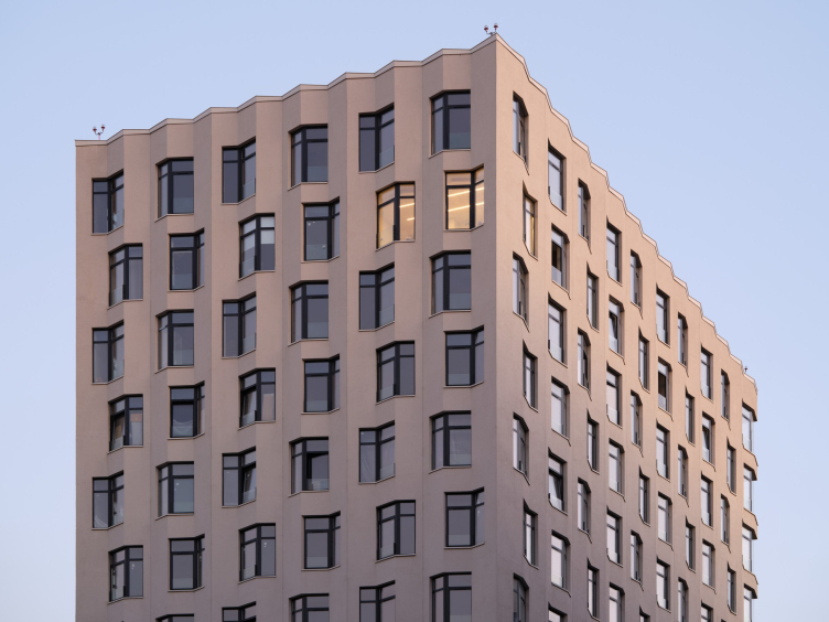
The first one is the building’s subtle “pleats”, evenly spaced. All four walls form a three-dimensional zigzag.
It must be said that this technique is well-known and beloved in 21st-century architecture because it delivers maximum impact with minimal decorative saturation. It operates through form: the “accordion” structure easily transforms the façade from flat to three-dimensional, simultaneously “pulling it together” with vertical lines, making it more slender, and creating a lively “comb” at the top without the need for additional ornamentation.
Block 14.1 “Chaika”. ZILArt
Copyright: Photograph © Maxim Loskutov / provided by DNK ag
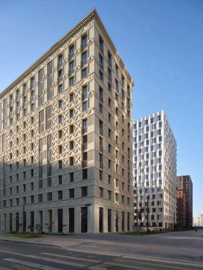
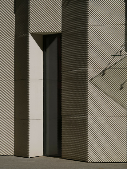
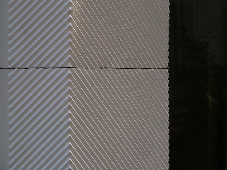
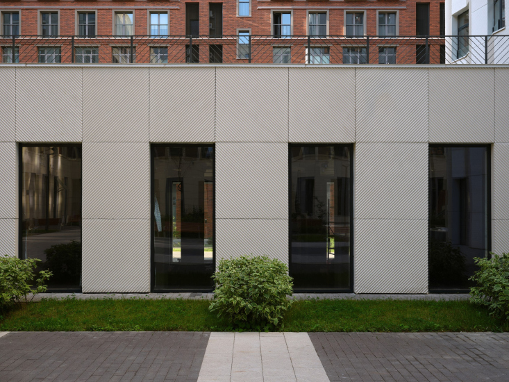
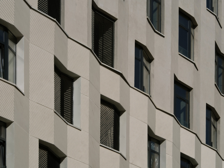
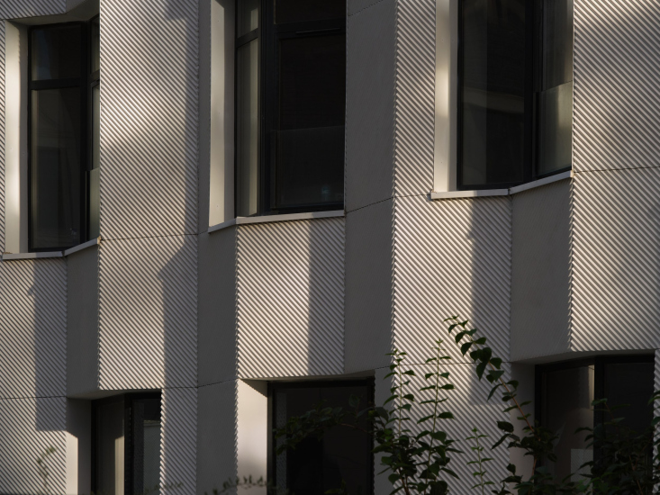
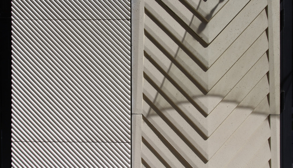
The second plastique opportunity is the diagonal groove shading. Spread across two surfaces, it deepens or brightens the tone, but most importantly, it sharpens the perception, much like any neat shading does.
However, when the shading of diagonal grooves covers the entire surface of the lower part, it ceases to be a minor detail and takes on what might be called intrinsic value. It becomes not just a decoration but a defining characteristic of the surface.
The shading is crafted in glass-fiber-reinforced concrete and serves to unify the entire stylobate section. The flat façade of the courtyard wall, filled with this pattern, clearly demonstrates its connection to the main volume. The same can be said of the folded but single-tiered shopfront façade – there are no extraneous lines, and the building appears to be carved “from a single stone.”
The upper tier is covered in plaster, yet it’s worth noting that the metal grilles of the technical openings repeat the diagonal pattern of the white panels in a recognizable way, creating a noticeable resonance between the two.
Another feature of the three-dimensional shading is that, under certain lighting conditions, the edges of the façade acquire a sheen akin to mother-of-pearl – not too bright but subtly enlivening the palette in a Falk-like manner, absorbing the tones of the surroundings.
Block 14.1 “Chaika”. ZILArt
Copyright: Photograph © Maxim Loskutov / provided by DNK ag
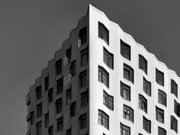
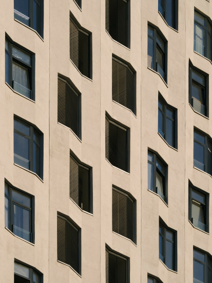
All these restrained details are notably animated by the checkerboard arrangement of the windows. Here, too, we observe a kind of “spare use of technique”: the combination of the folded façade and the checkerboard layout results in a relaxed dynamic of swirling, even flying. There’s little doubt that the “check marks” of the windows and inter-floor slabs, when viewed at an angle, remind us of a flock of birds. It’s a very subtle nod to a bird – or perhaps not to a bird, but to the idea of flight itself.
Block 14.1 “Chaika”. ZILArt
Copyright: Photograph © Maxim Loskutov / provided by DNK ag
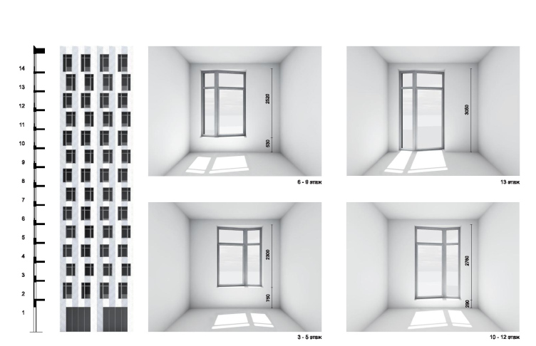
Inside the apartments, the windows, angled as they are, also follow the “folding” design.
Block 14.1 “Chaika”. ZILArt
Copyright: © DNK ag
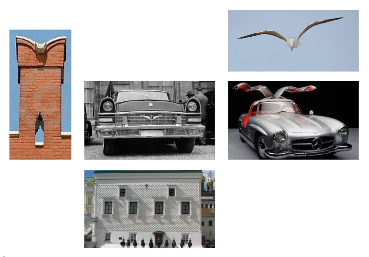
I must note that much here is indeed well thought out and aligned with the single theme. Take, for example, the contours of sunlight patches in the interiors. Or how the architects told us that the textured shading was inspired by the barbs of a bird’s feather. You see, all the details are tied together with a common meaning. It’s almost engaging, like unraveling a ball of yarn, though in this case, it doesn’t feel tangled at all.
Beyond birds and everything airborne, DNK ag also point to a whole range of prototypes, including the Faceted Chamber by Pietro Antonio Solari and the Kremlin’s “swallowtail” merlons. These comparisons are valid, but once again, I’d say that both the Renaissance diamond rustication and the battlements have transformed into something else here. Or rather, they peek out momentarily from another unity, wave to us, and then disappear. All analogies are “absorbed” by the project, processed, claimed, and deeply adapted. This is a high level of mastery when handling prototypes – they end up being very hard to trace.
Block 14.1 “Chaika”. ZILArt
Copyright: Photograph © Maxim Loskutov / provided by DNK ag
On sunny days, which do occasionally happen in Moscow, the theme of flight and swirling is picked up and enhanced by the reflections from the windows of neighboring buildings. Light reflections are fairly common in modern residential complexes, but what makes “Chaika” unique is that the light “imprint” of the neighboring house is perceived in full, clearly and vividly, as though it’s part of its design.
And so it probably is, as the sunlight “bounces” playfully along with the windows. Together, they form the dynamic of the building. The subtle, understated movement gathers at the prominent outer corner facing the pedestrian boulevard, almost confirming the guess: these window-“birds” are indeed flying somewhere.
Block 14.1 “Chaika”. ZILArt
Copyright: Photograph © Maxim Loskutov / provided by DNK ag
Architectural dynamics are difficult to explain but are, in fact, important. Physically, buildings don’t move, of course, but visually, many of them look as though they do. Optical effects can suggest latent, internal movement, sparking curiosity. Additionally, we are always in motion ourselves, becoming spectators. As our point of view shifts, the seemingly static volume changes and comes alive – through our perception. In addition, some buildings are more sensitive to their surroundings than others.
But then again, discussions about the environment are as nuanced as the notion of dynamics itself. Attention to the environment usually refers to low-rise construction or the repetition of neighboring architectural details. Here, the height is consistent – the building has 16 floors – but the adjacent designs are not repeated deliberately, as per the rules of the entire ZILArt project. When I speak of DNK ag’s building “reacting to the environment”, I mean a different kind of response – an immediate one. Its façades don’t “shout”; rather, they create a kind of boundary that behaves in two ways: under bright sunlight, it appears white, graphic, and poster-like; at dusk, it shimmers, gently levitating. It interacts with the surrounding environment without replicating it, but responds subtly.
It’s remarkable that all of this is achieved through four techniques at most, combined, like a chord.
Besides its form, the name of the building – “Chaika” (Seagull) – also matters. It’s not just that the name was suggested by the architects, contributing to the overall image, though that is significant. The name brings a contextual association to the most elite project of the Soviet automobile industry – kind of like a Soviet version of a Rolls-Royce or Mercedes. This author-given name completes the image and “anchors” the project to the area, recalling the memory of the automobile plant itself.
Block 14.1 “Chaika”. ZILArt. Images
However, the architects firmly deny any connection to the iconic logo of the Moscow Art Theater or Chekhov’s seagull. There’s no connection, they say.
What’s also interesting is that, amidst the plastique excess that Alexander Zmeul rightfully mentions – the architectural collection of ZILArt is filled with literal figurative statements, whether it’s the giant pigeons perched on the cornice of Alexander Brodsky’s building or the long-eared rabbits on the facade of Buromoscow.
“Chaika” is different, closer to an abstract expression, though the presence of a name itself also speaks volumes. Nonetheless, in an era of loud PR and straightforward declarations, one begins to appreciate this kind of subtle refinement.
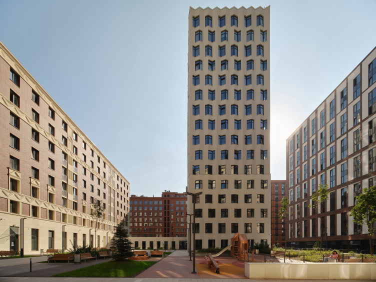
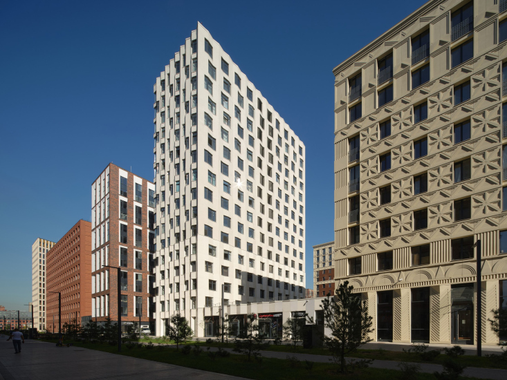
In relation to its surroundings, made up of works by various architects, largely unified by a “brick” design code and a block-based layout, “Chaika” is concise but not neutral. The building cannot be understood as a pause of silence amidst an intense crescendo; or if it can, it’s still not quite that. The building across from it echoes with white inserts; and on another street, out of direct sight, Yuri Grigoryan’s building develops a similar theme of light, pearlescent façades.
But the main dialogue is between “Chaika” and Ilya Utkin’s “chevron” building. Together, they form a bright spot in the brick development, with “Chaika” being white and Ilya Utkin building the color of yellowish sandstone, although both façade are made of glass-fiber reinforced concrete.
It’s interesting to observe these two buildings at their junction: the white relief consists of fine, contrasting lines, while the yellow one is noticeably larger and modeled in volume.
Ilya Utkin’s building has a cornice, and in the striped wall piers, one can discern fluting. A quick glance may read it as a “Stalinist” building. Meanwhile, the DNK ag building forms a contrasting pair – not in color, but in meaning, like classicism and modernism. Both, it must be said, do not follow direct citation but are “verified” by contemporary trends: Ilya Utkin’s classicism is ornamented and exaggeratedly magnified, while DNK ag’s modernism is refined and detailed.
Both respond to ZILArt’s commitment to authorial architectural statements and become, if not the most striking, then certainly an interesting addition to the “architectural collection”.


