По-русски

Black and White

In this article, we specifically discuss the interiors of the ATOM Pavilion at VDNKh. Interior design is a crucial component of the overall concept in this case, and precision and meticulous execution were highly important for the architects. Julia Tryaskina, head of UNK interiors, shares some of the developments.

04 March 2024
Object
mainImg
We already provided a detailed coverage of the architecture of the ATOM Pavilion at VDNKh; now we are focusing on the interiors.

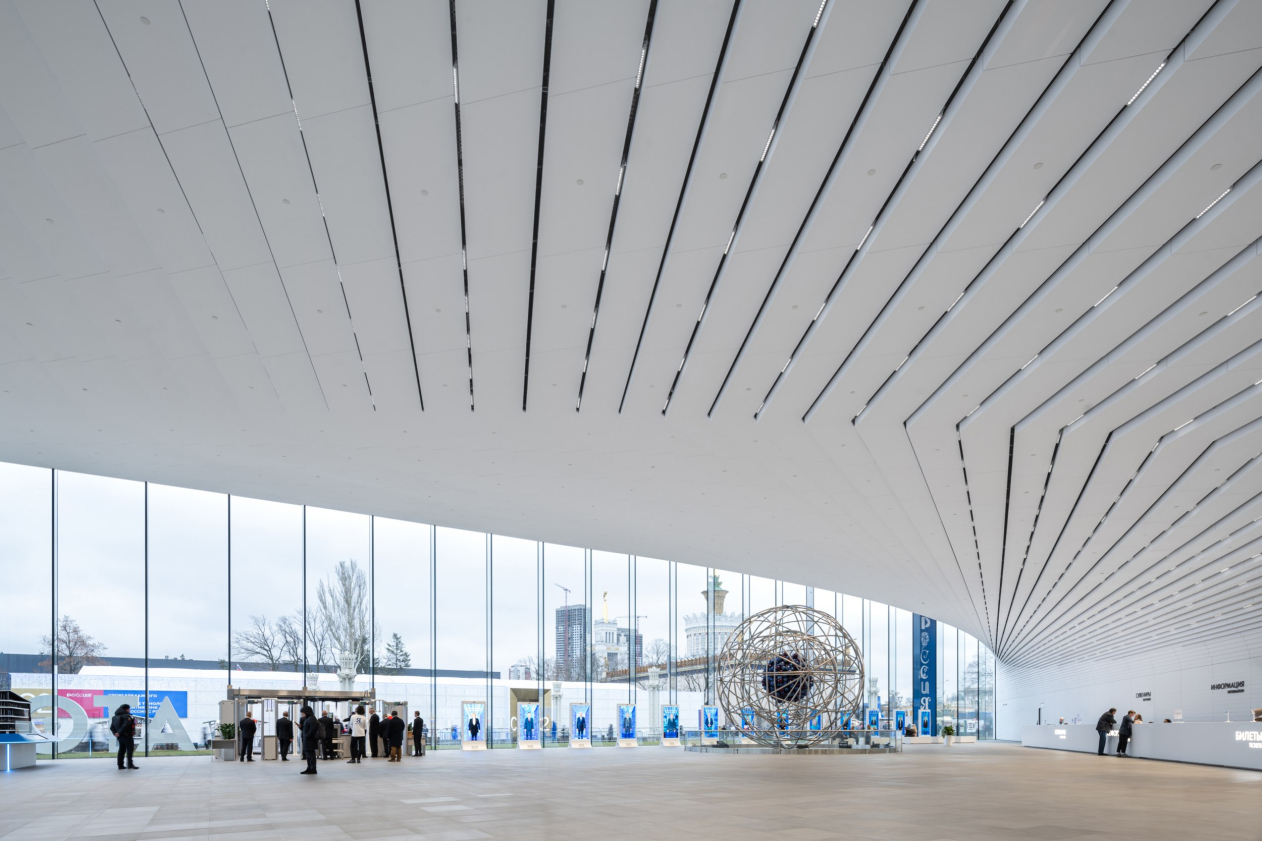
The architects interpret the foyer as a warm analogue of a town square. Its open space, flooded with light streaming through two entirely glass walls, is covered by a white cantilever. The space is full of light.

The ATOM pavilion at VDNKh
Copyright: Photograph © Ilia Ivanov / provided by UNK


Upon entering the foyer, the visitor transitions into the space of what we called a “communication diagonal”, oriented transversely. It is approximately 7 meters high.

And this space, conversely, is entirely black.

The ATOM pavilion at VDNKh
Copyright: Photograph © Dmitry Chebanenko / provided by UNK


This was the architects’ intention – to build the pavilion on the maximum contrast of opposite things and emotions.

The communication diagonal connects two volumes of a triangular plan, which house the exposition areas (the exposition design was done by Lorem Ipsum) along with other functional spaces.

At the same time, on an emotional level, the space of the communication diagonal helps the visitor to feel the scale of the pavilion from the inside. “A visitor is transitioned from one space to another” the architects explain “Equally vast, cohesive, but different, contrasting with the first, and, again, without any noticeable supporting structures”.

Julia Tryaskina

Our “diagonal” is the place where the floor and ceiling visually disappear; it narrows and stretches the space, making it feel almost infinite.

Consequently, contrast was crucial for us, and it was important to execute it seamlessly at the perception level so that no inaccuracies would compromise the intended effect. The goal was to achieve a cohesive result: pure white and solid black. Our task extended beyond concealing technical details, where colleagues from Spectrum greatly assisted us. We also had to integrate mirrors into the overall system (they enhance the sense of infinity), and escalators, which also require technical lighting.

Our challenge didn’t end there – we had to put everything together and make sure there are no color discrepancies. The same RAL color, when applied to different surfaces, can appear with slight variations – sometimes greenish, sometimes brownish. Therefore, we meticulously reviewed everything, created numerous mock-ups, worked with paints and samples, aimed to unify the color temperature, and strived for the resulting shade to be as neutral as possible. We did this for both the black and white spaces, but working with black is known to be more challenging because every speck of dirt and dust is visible.

Speaking of cleaning, our interiors are designed to withstand constant cleaning combined a high flow of visitors. In our public areas – and I’m not referring here to the museum exhibition, which operates under different rules – everything is touchable, and visitors can run their hands over surfaces without causing damage. We have significant experience working with high-traffic spaces, whether in shopping centers or airports, so we understand the principles of their construction.

Lighting the black space also proved to be a significant challenge: we illuminate only at key navigation points – similar to a theater, you need to highlight the essential and dim the rest; otherwise, the space won’t remain black. It’s crucial not to overilluminate.


The ATOM pavilion at VDNKh. The cummunication core. Temporary expositions on the walls
Copyright: Photograph © Ilia Ivanov / provided by UNK


Speaking about light, currently the pavilion still has a very high flow of visitors, and the lighting, including the lighting inside the communication diagonal, is “cranked up” to 100% – whereas according to the architects’ recommendations, the lamps should shine at 60%, which will make the effect of black space more noticeable.

What is interesting about this whole story – and the pavilion as a whole, for that matter – is the sheer volume of the architects’ engineering solutions, both generally structural and those related to the interiors. Back at the presentation, I asked Julius Borisov if I could publish the information about the “nodes”, and he said yes.

Now we have asked Julia Tryaskina for a few interior design assemblies – and she says that she considers such publications important – since her student years she has loved to look at the drawings of her colleagues’ design solutions. With the permission of the architects’ team, we publish below a few “nodes” related to interior constructions.


Another story unfolded during the design process and was related to the placement of a model of an atomic bomb in one of the exposition halls. Julia Tryaskina emphasizes that this is not even a model, but a real atom bomb shell made at the same production facility, and therefore life-size. Its dimensions escaped the architects’ attention at first, and then it turned out that in order to create a sufficiently spectacular hall with the bomb, it was necessary to raise the height of the hall by adding a dome, which resulted in a “bulge” in the atrium space above. After much discussion, it was decided to mask the “bulge” as a green ball, surrounded by the amphitheater. Here we see a public space, designed, among other things, for events and arrangement of tables in front of the conference hall. The library and the museum store are also located here, i.e. the atrium hosts the commercial premises of the pavilion.

  • zooming
    The lounge area. ATOM Pavilion at VDNKh
    Copyright: © UNK / render
  • zooming
    The lounge area. ATOM Pavilion at VDNKh
    Copyright: Photo: provided by the press service of the ATOM Foundation


Another part of the pavilion’s public spaces are triangular staircases: gray concrete, printed glass, and steel handrails. Their shape, conditioned by the building’s structure – angles between the hypotenuse and cathetuses – brings to mind similar staircases arranged by UNK in the triangular building of the “Zemelny” business center, but in “Zemelny” they are in fact emergency staircases (although they are also very interesting), while here, in the ATOM pavilion, at least one of the staircases is actively used by visitors of the restaurant in the upper floor of the building.

  • zooming
    The ATOM pavilion at VDNKh
    Copyright: Photograph © Ilia Ivanov / provided by UNK
  • zooming
    The ATOM pavilion at VDNKh.
    Copyright: Photograph © Ilia Ivanov / provided by UNK


Thus, the interiors of the public spaces of the ATOM pavilion, designed by UNK interiors, are primarily based on the contrast between the white wide space of the foyer and the black, narrow, yet seemingly infinite, space of the communication diagonal. To convey the key statement, the architects performed extensive work on details and nuances, refining mock-ups and paint finishes. As always, the miracle effect doesn’t just “happen” on its own.

In this case, this contrast is needed not only to “switch” the visitor’s perception, but it also has a semantic coloring – as Julia Tryaskina says, “there are no halftones, no indifferent people when it comes to nuclear energy. And there is no author’s opinion –  it’s either white or it’s black”.

This statement is hard to dispute. And, on the other hand, it is clear why so much effort was put into the execution of this metaphor, internally graphic, yet, at the same time “speaking” and even “shouting” to some extent.
 

04 March 2024

Headlines now
​A Brick Shell
In the process of designing a clubhouse situated among pine trees in a prestigious suburban area near Moscow, the architectural firm “A.Len” did the façade design part. The combination of different types of brick and masonry correlates with the volumetric and plastique solutions, further enhanced by the inclusion of wood-painted fragments and metal “glazing”.
Word Forms
ATRIUM architects love ambitious challenges, and for the firm’s thirtieth anniversary, they boldly play a game of words with an exhibition that dives deep into a self-created vocabulary. They immerse their projects – especially art installations – into this glossary, as if plunging into a current of their own. You feel as if you’re flowing through the veins of pure art, immersed in a universe of vertical cities, educational spaces – of which the architects are true masters – and the cultural codes of various locations. But what truly captivates is the bold statement that Vera Butko and Anton Nadtochy make, both through their work and this exhibition: architecture, above all, is art – the art of working with form and space.
Flexibility and Acuteness of Modernity
Luxurious, fluid, large “kokoshniks” and spiral barrel columns, as if made from colorful chewing gum: there seem to be no other mansion like this in Moscow, designed in the “Neo-Russian-Modern” style. And the “Teremok” on Malaya Kaluzhskaya, previously somewhat obscure, has “come alive with new colors” and gained visibility after its restoration for the office of the “architectural ecosystem” as the architects love to call themselves. It’s evident that Julius Borisov and the architects at UNK put their hearts into finding this new office and bringing it up to date. Let’s delve into the paradoxes of this mansion’s history and its plasticity. Spoiler: two versions of modernity meet here, both balancing on the razor’s edge of “what’s current”.
Yuri Vissarionov: “A modular house does not belong to the land”
It belongs to space, or to the air... It turns out that 3D printing is more effective when combined with a modular approach: the house is built in a workshop and then adapted to the site, including on uneven terrain. Yuri Vissarionov shares his latest experience in designing tourist complexes, both in central Russia and in the south. These include houseboats, homes printed from lightweight concrete using a 3D printer, and, of course, frame houses.
​Moscow’s First
“The quality of education largely depends on the quality of the educational environment”. This principle of the last decade has been realized by Sergey Skuratov in the project for the First Moscow Gymnasium on Rostovskaya Embankment in the Khamovniki district. The building seamlessly integrates into the complex urban landscape, responding both to the pedestrian flow of the city and the quiet alleyways. It skillfully takes advantage of the height differences and aligns with modern trends in educational space design. Let’s take a closer look.
Looking at the Water
The site of Villa Sonata stretches from the road to the water’s edge, offering its own shoreline, pier, and a picturesque river panorama. To reveal these sweeping views, Roman Leonidov “cut” the façade diagonally parallel to the river, thus getting two main axes for the house and, consequently, “two heads”. The internal core – two double-height spaces, a living room and a conservatory, with a “bridge” above them – makes the house both “transparent” and filled with light.
The White Wing
Well, it’s not exactly white. It’s more of a beige, white-stone structure that plays with the color of limestone – smoother surfaces are lighter, while rougher ones are darker. This wing unites various elements: it absorbs and interprets the surrounding themes. It responds to everything, yet maintains a cohesive expression – a challenging task! – while also incorporating recognizable features of its own, such as the dynamic cuts at the bottom, top, and middle.
Urban Dunes
The XSA Ramps team designed and built a three-part sports hub for a park in Rostov-on-Don, welcoming people of all ages and fitness levels. The skate plaza, pump track, and playground are all meticulously crafted with details that attract a diverse range of visitors. The technical execution of the shapes and slopes transforms this space into a kind of sculptural composition.
Proportional Growth
The project for the fourth phase of the ÁLIA residential area has been announced. The buildings are situated on an elongated plot – almost a “ray” that shoots out from the center of the area towards the river. Their layout reflects both a response to Moscow’s architectural preferences over the past 15 years, shifting “from blocks to towers”, and an interpretation of the neighboring business park designed by SOM. Additionally, the best apartments here are not located at the very top but closer to the middle, forming a glowing “waistline”.
The “Staircase” Building
In designing the “Details” residential complex in New Moscow, Rais Baishev spiced up the now-popular Moscow theme of a “courtyard” building with an idea drawn from the surrealist drawings by Maurits Escher. He envisioned the stepped silhouettes and descending slopes as a metaphysical mega-staircase, creating a key void within the courtyard that gave the project an internal “spine”. This concept is felt both in the building’s silhouette and on its façades.
Projection of the Quarter
No one doubted that the building that Vladimir Plotkin designed as part of the “Garden Quarters” would be the most modernist of all. And it turned out just that way: while adhering to the common design code, the building successfully combines brick and white stone, rhythmically responding to the neighboring building designed by Ostozhenka, yet tactfully and persistently making a few statements of its own. This includes the projection of the ideal urban development composition “14–9–6”, which can be found right next door, mathematical calculations, including those for various types of terraces (and perhaps the only reminder of the Soviet past of the Kauchuk rubber factory!), and the white “cross-stitch” pattern of the façade grid.
Domus Aurea
In this issue, we examine the “Tessinsky-1” house, designed by Sergey Skuratov and completed in 2023. Located in the middle of the Serebryanicheskaya Embankment district, at the intersection of its main streets, this house assumes a sort of “nodal” role: it not only responds to everything around it and preserves many memories of the former EMA factory within itself, but it weaves all this into a newly directed pattern, reconciling bright “gold” and dark-colored brick, largely with the help of the new, modern-yet-archaic Columba brick, which, come to think about it, is the most precious element here.
The Chimney of Nikola-Lenivets
In this issue, we are examining the “Obelisk House” designed by KATARSIS and built for the Arkhstoyanie 2023 festival. However, it was only finished later on, and this is why we are examining it now. It seems to us that after the “Obelisk House” appeared in Nikola-Lenivets, a dialogue and a few inner connections appeared between the temporary structures built here. These houses no longer look like “accidental neighbors”, more of which below.
​Periscope by the Bay
The jury awarded the second place in the competition for a public and cultural center in Petropavlovsk-Kamchatsky to the companies GORA (“Mountain”) and M4. In the consortium’s proposal, the building resembles a sperm whale with a calf swimming next to it or a periscope, whose lenses capture the most spectacular views from the surrounding landscape.
From Arcs to Dolmens
While working on the competition project for Petropavlovsk-Kamchatsky, ASADOV Architects prioritized the value of the natural and urban environment, aiming to preserve the balance of the location while minimizing the resemblance of the volume that they designed to a “traditional building”. The task was challenging, and the architects created three versions, one of which having been developed after the competition, where their main proposal took third place. However, the point of interest here is not the competition result but the continuity of creative thinking.
Hide and Seek
The ID Moskovskiy house, designed by Stepan Liphart in St. Petersburg, in the courtyards near Moskovskiy Avenue beyond the Obvodny Canal and recently completed, is notable for several reasons. Firstly, it has been realized with considerable accuracy, which is particularly significant as this is the first building where the architect was responsible not only for the facades but also for the layouts, allowing for better integration between the two. On the other hand, this building is interesting as an example of the “germination” of new architecture in the city: it draws on the best examples from the neighborhood and becomes an improved and developed sum of ideas found by the architect in the surrounding context.
The Big Twelve
Yesterday, the winners of the Moscow Mayor’s Architecture Award were announced and honored. Let’s take a look at what was awarded and, in some cases, even critique this esteemed award. After all, there is always room for improvement, right?
Above the Golden Horn
The residential complex “Philosophy” designed by T+T architects in Vladivostok, is one of the new projects in the “Golubinaya Pad” area, changing its development philosophy (pun intended) from single houses to a comprehensive approach. The buildings are organized along public streets, varying in height and format, with one house even executed in gallery typology, featuring a cantilever leaning on an art object.
Nuanced Alternative
How can you rhyme a square and space? Easily! But to do so, you need to rhyme everything you can possibly think of: weave everything together, like in a tensegrity structure, and find your own optics too. The new exhibition at GES-2 does just that, offering its visitor a new perspective on the history of art spanning 150 years, infused with the hope for endless multiplicity of worlds and art histories. Read on to see how this is achieved and how the exhibition design by Evgeny Ace contributes to it.
Blinds for Ice
An ice arena has been constructed in Domodedovo based on a project by Yuri Vissarionov Architects. To prevent the long façade, a technical requirement for winter sports facilities, from appearing monotonous, the architects proposed the use of suspended structures with multidirectional slats. This design protects the ice from direct sunlight while giving the wall texture and detail.
Frozen Magma
A competition for the creation of a public and cultural center was held in Petropavlovsk-Kamchatsky. Three architectural companies made it to the final, and we consider it important to share about the work of each. Let’s start with the winner – the consortium led by Wowhaus.
Campus within a Day
In this article, we talk about what the participants of Genplan Institute of Moscow’s hackathon were doing at the MosComArchitecture booth at the “ArchMoscow” exhibition. We also discuss who won the prize and why, and what can be done with the territory of a small university on the outskirts of Moscow.
Vertical Civilization
Genpro considered the development of the vertical city concept and made it the theme of their pavilion at the “ArchMoscow” exhibition.
Marina Yegorova: “We think in terms of hectares, not square meters”
The career path of architect Marina Yegorova is quite impressive: MARHI, SPEECH, MosComArchitectura, the Genplan Institute of Moscow, and then her own architectural company. Its name Empate, which refers to the words “to draw” in Portuguese and “to empathize” in English, should not be misleading with its softness, as the firm freely works on different scales, including Integrated Territorial Development projects. We talked with Marina about various topics: urban planning experience, female leadership style, and even the love of architects for yachting.
Andrey Chuikov: “Optimum balance is achieved through economics”
The Yekaterinburg-based architectural company CNTR is in its mature stage: crystallization of principles, systematization, and standardization helped it make a qualitative leap, enhance competencies, and secure large contracts without sacrificing the aesthetic component. The head of the company, Andrey Chuikov, told us about building a business model and the bonuses that additional education in financial management provides for an architect.
The Fulcrum
Ostozhenka Architects have designed two astonishing towers practically on the edge of a slope above the Oka River in Nizhny Novgorod. These towers stand on 10-meter-tall weathered steel “legs”, with each floor offering panoramic views of the river and the city; all public spaces, including corridors, receive plenty of natural light. Here, we see a multitude of solutions that are unconventional for the residential routine of our day and age. Meanwhile, although these towers hark back to the typological explorations of the seventies, they are completely reinvented in a contemporary key. We admire Veren Group as the client – this is exactly how a “unique product” should be made – and we tell you exactly how our towers are arranged.
Crystal is Watching You
Right now, Museum Night has kicked off at the Museum of Architecture, featuring a fresh new addition – the “Crystal of Perception”, an installation by Sergey Kuznetsov, Ivan Grekov, and the KROST company, set up in the courtyard. It shimmers with light, it sings, it reacts to the approach of people, and who knows what else it can do.
The Secret Briton
The house is called “Little France”. Its composition follows the classical St. Petersburg style, with a palace-like courtyard. The decor is on the brink of Egyptian lotuses, neo-Greek acroteria, and classic 1930s “gears”; the recessed piers are Gothic, while the silhouette of the central part of the house is British. It’s quite interesting to examine all these details, attempting to understand which architectural direction they belong to. At the same time, however, the house fits like a glove in the context of the 20th line of St. Petersburg’s Vasilievsky Island; its elongated wings hold up the façade quite well.
The Wrap-Up
The competition project proposed by Treivas for the first 2021 competition for the Russian pavilion at EXPO 2025 concludes our series of publications on pavilion projects that will not be implemented. This particular proposal stands out for its detailed explanations and the idea of ecological responsibility: both the facades and the exhibition inside were intended to utilize recycled materials.
Birds and Streams
For the competition to design the Omsk airport, DNK ag formed a consortium, inviting VOX architects and Sila Sveta. Their project focuses on intersections, journeys, and flights – both of people and birds – as Omsk is known as a “transfer point” for bird migrations. The educational component is also carefully considered, and the building itself is filled with light, which seems to deconstruct the copper circle of the central entrance portal, spreading it into fantastic hyper-spatial “slices”.